Learning Insights from STAR Schema, Data Visualization, Data Profiling, and Warehouse Design
Hello Everyone,
It’s been three weeks since my initial post and there has been a lot of information to cover and review. In our recent lectures, we’ve explored data visualizations, data quality, data analysis, and the design principles for data warehouses. These topics highlight the importance of using data in ways that will be useful and actionable, specifically through visualization and data profiling. Additionally, throughout these three weeks, we revisit the importance of data warehouse strategies in business intelligence efforts.
Review of Lectures and Supplementary Articles
To review specifically what we covered in the lectures, let’s start with how the STAR Schema aligns with the overarching business intelligence goal of connecting data structures to business goals. Surrogate keys, role-playing dimensions, junk dimensions, and fact tables ensure that models are accurate and adaptable to change, supporting overarching business intelligence objectives of enabling data-based decision-making. And these STARS Schema strategies don’t just enable decision-making based on only real-time data, slowly changing dimensions and date/time dimensions allow the modeling of historical data changes while maintaining operational efficiency. These items are essential for building data warehouses that create meaningful insights and efficient answers. Additionally, as important to how the data warehouse is set up is the quality coming in. Jim Harris’s article on data profiling reinforces the balance between automated tools for gauging data quality and the human interpretation of data. Profiling tools will easily identify issues like NULL values, inconsistencies in data type, or missing data, which is essential when trying to have the data interpreted by business intelligence tools. This process of profiling the data supports Master Data Management (MDM) and governance initiatives, laying the groundwork for data management.
Now what do we do after creating these data models and visualization? Once we have good data and efficient data warehouses built, we need methods to make their findings more accessible. Hans Rosling’s dynamic bubble charts demonstrate how animation and interactive visuals can bridge that gap between accessibility and complex data. By incorporating multiple variables his visualization engages viewers and allows them to observe statistical patterns over time. This approach to dynamic data transforms a raw output into a meaningful narrative. Including historical context will also enhance the meaning and understanding of why the data may look the way it does. This is why data visualization and quality analysis are the foundations of effective business intelligence. The balance between intuitive design, as shown by Rosling’s dynamic charts, and technical executions, like in the STAR Schema, is essential in business intelligence.
Interpretations and Personal Connections to the Material
The material covered over the last three weeks has resonated deeply with my work in information technology. I support complex software systems for operations, manufacturing, and supply chain users. Beyond standing up and maintaining data warehousing tools for operational data, I also manage incident ticketing systems through ServiceNow (SNOW). For those unfamiliar, SNOW is a leading platform in IT service management. Its Now Platform enables integration across disparate systems, such as Active Directory and asset management, serving as a data platform and a foundation for business intelligence (BI). For example, SNOW allows data from separate systems to be referenced seamlessly, enabling efficient creation and management of Help Desk tickets. At my company, much of our business intelligence derives from SNOW, and seeing how STAR Schemas and multi-warehouse data architectures work in tandem is fascinating.
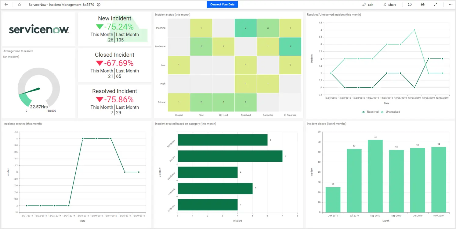
SNOW is more than just a data repository; it facilitates dynamic dashboard creation. As the SNOW environment manager for my support group, I’ve built dashboards to monitor key performance indicators (KPIs) in real-time. My most utilized dashboard features:
• Support tickets by month (year-to-date)
• Support tickets by software by week/month
• Support tickets by team member by week/month
• Current resolution time vs. last month’s resolution time vs. departmental goal
These visualizations help me allocate resources effectively. For instance, if a critical outage generates a surge of tickets with long resolution times, I can promptly redirect team members to assist. Conversely, if tickets are resolved quickly, I can monitor progress without reallocating resources unnecessarily while staying ready to intervene if needed.
Here’s an example of what one of these SNOW dashboards looks like:
Historical data is crucial for effective decision-making. Long-tenured employees often act as "living data warehouses" because their institutional knowledge makes them invaluable. However, integrating historical context into new systems can mitigate tensions between "old" and "new" ways of thinking. Ignoring the reasoning behind legacy decisions risks the success of new implementations. In IT, we build upon the work of those before us, who made the best decisions possible with the information they had. No one aims to create flawed systems or leave gaps in data, yet historical context ensures we honor and learn from their efforts.
This importance of historical data extends to visualizations. While it’s easy to present selectively favorable metrics—like focusing on a quarter’s growth despite poor annual performance—misleading visuals can have unintended consequences. For example, the 2008 financial crisis, as explored in Data and Disaster, might have been mitigated had agencies and investment firms shared uncensored information. The integrity of dashboards and visualizations is paramount since they are the foundation for critical business intelligence.
Conclusion
In conclusion, understanding the importance of a solid data warehouse foundation combined with effective data presentation and analysis is critical for driving meaningful business intelligence. From the STAR Schema to dynamic visualizations and data profiling, each component must work to make big data, and their insights, truly effective. Whether through animated visualizations that make complex data more accessible or data profiling that ensures integrity and accuracy, these lessons emphasize that successful business intelligence relies equally on thoughtful design, data quality, and robust technical infrastructure. Moving forward, I will apply these insights to my daily work, enhancing the reliability and presentation of my data analyses.
References
Francis, Louise, and Virginia R. Prevosto. “Data and Disaster: The Role of Data in the Financial Crisis.” Casualty Actuarial Society, 2 Aug. 2022, www.casact.org/abstract/data-and-disaster-role-data-financial-crisis. Accessed 17 Nov. 2024.
Harris, Jim. “OCDQ Blog.” OCDQ Blog, 3 Aug. 2009, www.ocdqblog.com/home/adventures-in-data-profiling-part-1.html. Accessed 16 Nov. 2024.
“ITIL 4 Dashboards.” Ivanti.com, 2023, help.ivanti.com/ch/help/en_US/CSM/10.5/documentation_bundle/mapps_and_integrations/mapp_tech_notes/itil_4_dashboards.html. Accessed 16 Nov. 2024.
“ITIL Key Performance Indicators | IT Process Wiki.” IT Process Maps, wiki.en.it-processmaps.com/index.php/ITIL_Key_Performance_Indicators.
“Key Metrics for Your Business Growth with FreshBooks | Bold BI.” Bold BI, Oct. 2019, https://doi.org/1072678817/ALNeCIislMsZEKGPv_8D. Accessed 14 Nov. 2024.
Mokkup.ai. “8 Essential Dashboard Design Principles for Effective Data Visualization.” Medium, 14 Sept. 2023, medium.com/@mokkup/8-essential-dashboard-design-principles-for-effective-data-visualization-40653c5fd135.
Naveen Puttagunta. “Council Post: Elevating User Engagement: The Crucial Role of Well-Designed Dashboards.” Forbes, 12 Aug. 2024, www.forbes.com/councils/forbesbusinesscouncil/2023/08/02/the-crucial-role-of-well-designed-dashboards/.
Rosling, Hans. “The Best Stats You’ve Ever Seen.” Www.ted.com, 27 June 2006, www.ted.com/talks/hans_rosling_the_best_stats_you_ve_ever_seen?subtitle=en.
“ServiceNow Dashboard CData Software.” CData Software, 2024, https://cdn.boldbi.com/wp/blogs/servicenow/servicenow-dashboard-v1.webp. Accessed 16 Nov. 2024.
Spider Strategies. “What Is a Balanced Scorecard? - Spider Strategies.” What Is a Balanced Scorecard? - Spider Strategies, www.spiderstrategies.com/balanced-scorecard/.
“What Is ServiceNow? - ServiceNow.” ServiceNow, 2019, www.servicenow.com/what-is-servicenow.html.
Hi, I enjoyed reading your insights and applied knowledge of our course to the SNOW dash-boarding. I use Service Now at work on daily bases too, mainly for incidents follow-ups and RCAs and filing deployment CHG tickets. Actually, I have a tall order to add analytical dashboards for my program to track production incidents as well as tracking maintenance time windows "overtimes" during production deployments. If you have some recommended free material fir creating SNOW dashboards - I would appreciate it if you share.
ReplyDeleteHi Andre,
DeleteThank you for your kind words and for sharing how you use ServiceNow (SNOW) in your role! It’s great to hear that you’re looking to expand into analytical dashboards for tracking production incidents and maintenance windows. SNOW’s dashboarding capabilities are incredibly flexible and can be a game-changer for tracking metrics like these.
This article might help you get started:
https://medium.com/@enochpakanti19/how-to-create-servicenow-dashboards-1429324ce627
Hey Evan,
ReplyDeleteThis is a great example of bridging the gap of information from the text and real world experiences. I like the comparison of SNOW in relation to your work. The charts also add a nice touch and help put together the comparison of how it relates to what we are learning. It is nice to know we can start to automate this kind of information and piece it together as this has become such a tedious task but one that holds great power and value. The information pulled from Star Schema maps and data warehouses prove to be a vital part of how businesses will operate to grow and understand how to decide what products to utilize or sell and how to prevent mistakes or issues from happening. We utilize SNOW in our company as well and it shows great metrics on each employee's job and what tasks they are accomplishing. It also helps understand what issues the users are facing and how we can tackle those situations. Great post and thank you.
Joe Rebidas
Hi Joe,
DeleteThank you for your thoughtful comment and kind words! I'm glad the connection between STAR Schema concepts and SNOW resonated with you, especially since SNOW has become such a vital tool in so many organizations. Automating the extraction and visualization of metrics certainly reduces the tedious aspects of data analysis while empowering teams with actionable insights.
I completely agree—SNOW provides excellent visibility not just into individual and team performance but also into broader trends that can shape strategic decisions. It’s fascinating how similar challenges and opportunities with SNOW are surfacing across different groups, whether that’s addressing user issues or refining workflows based on historical data.
Your point about leveraging data from STAR Schemas and data warehouses to guide product or operational decisions really hits home. As you mentioned, it’s not just about fixing problems as they arise but also about using data to proactively mitigate risks and seize growth opportunities. It’s exciting to see how our teams are collectively finding value in these tools and methodologies.
Hello Evan,
ReplyDeleteYour reflections on the past three weeks' material offer an excellent synthesis of complex topics, I enjoyed reading through your blog!
You mentioned the significance of STAR Schema and its components—surrogate keys, role-playing dimensions, and fact tables—in creating adaptable and efficient data models. These features are indispensable for aligning data structures with business objectives.
The real-world application through ServiceNow (SNOW) dashboards is interesting. I do use ServiceNow at my organization to manage workflows and incident tickets. Although we are not using it to the extent of your organization, the data from ServiceNow fits into the idea of Business Intelligence. The dashboard visualization provides insight into performance and potential issues associated with your process. This is particularly valuable to management for decision making and improvements.
In the information security realm, we also track our status by using tools like Qualys to monitor for vulnerabilities. Qualys is a vulnerability management tool that provides software scanning, vulnerability detection, and vendor security management. It provides us with a very similar output/dashboard to the one you shared with us! I think dashboards have become the most useful information for management.
In conclusion, your post offers an excellent roadmap for applying business intelligence principles in real-world scenarios. You’re not only engaging with the material but also leveraging it to enhance your professional practice. Thank you for sharing these insights—I look forward to hearing more about how these concepts evolve in your work!
P.S.: I hope ServiceNow improves their user interface as well. It is not the best tool to use, but definitely the biggest service management tool.
Thank you for your thoughtful and encouraging comment! I’m glad you found the blog post engaging and that it resonated with your own experiences in using ServiceNow and other tools like Qualys for business intelligence and information security. It’s fascinating how these platforms serve as foundations for real-time decision-making, whether in operational support or vulnerability management. Your mention of Qualys highlights an excellent parallel—both platforms demonstrate the power of dashboards to distill complex data into actionable insights.
DeleteI agree that dashboards have become an indispensable tool for management, bridging the gap between raw data and strategic decisions. Tools like ServiceNow and Qualys not only provide insights into current operations but also empower teams to anticipate and address potential challenges proactively. It’s interesting to think about how these insights extend beyond IT into domains like risk management and compliance, ensuring organizations remain agile and secure in an ever-evolving landscape.
Regarding your point about ServiceNow’s interface, I couldn’t agree more—it’s a powerful tool, but its usability sometimes leaves room for improvement. Customizing dashboards and streamlining workflows can be clunky at times, and it often takes a deep understanding of the platform to achieve the desired outcomes efficiently. I’m hopeful that as ServiceNow continues to innovate, they will prioritize user experience improvements alongside their robust functionality.
Thanks again for sharing your perspective! It’s always great to hear how others are applying these concepts in their own organizations. Let’s stay connected, and I’d love to hear more about how Qualys and other tools support your BI initiatives!
Hello,
ReplyDeleteI really like your blog, your reflections on the comparison of SNOW highlights the value of tracking tasks, employee performance, and user-facing issues. As you've mentioned, it’s incredible how technologies like these can simplify the management of complex data, making processes more efficient while giving companies valuable insights into their operations. Finally the tools of SNOW when integrated into a company's workflows, it allows for better decision-making, streamlining efforts across departments, and ultimately preventing issues before they become larger problems.